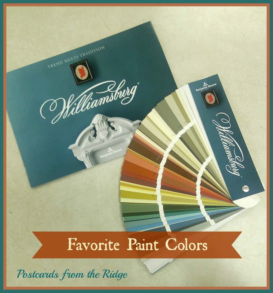
Favorite Paint Colors ~ The New Williamsburg Collection from Benjamin Moore
Today I’ll be previewing a portion of a palette of historical hues from the 18th and early 19th centuries instead of just one single color. We’ll be taking a look the at Williamsburg Collection
from Benjamin Moore. This color palette has 144 timeless, beautiful paint colors .
Benjamin Moore Williamsburg Collection
The theme of this color collection is “where trend meets tradition”. Within the palette, there are 45 authentic Williamsburg colors curated by Benjamin Moore and The Colonial Williamsburg Foundation. For more information about Williamsburg, visit here.

Here are some of my favorites. All of the photos are from Benjamin Moore.
Williamsburg Paint Colors from Benjamin Moore
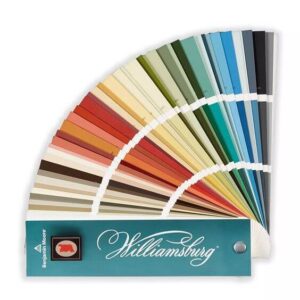
Get your own fan deck
Grab your own Williamsburg color fan deck to see all the true colors of this versatile collection.
The soft aqua and neutral tan with the crisp trim look so heavenly. It’s very reminiscent of homes found in Williamsburg.
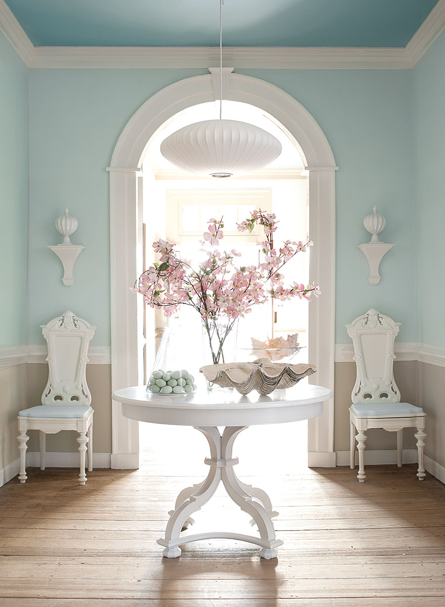
Upper Walls: CW-585 Ewing Blue, Lower Walls: CW-30 Market Square Shell, Ceiling: CW-595 Chesapeake Blue, Trim: CW-5 Harwood Putty
Benjamin Moore Tyler Gray
Tyler Gray is a favorite neutral in the collection. Much like the ever-popular Revere Pewter, it would pair nicely with almost any other color.
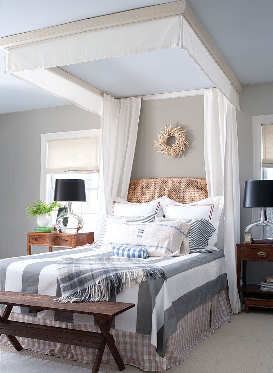
Walls: CW-50 Tyler Gray, Ceiling: CW-650 Palace Pearl
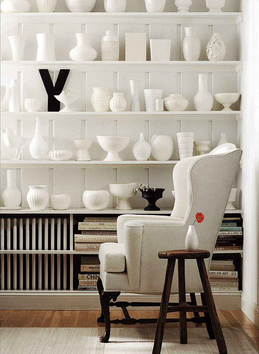
Williamsburg Wythe Blue
The Williamsburg Wythe Blue in the back of the bookcases really makes a statement. It’s a nice contrast and all of the decor items really stand out against it.
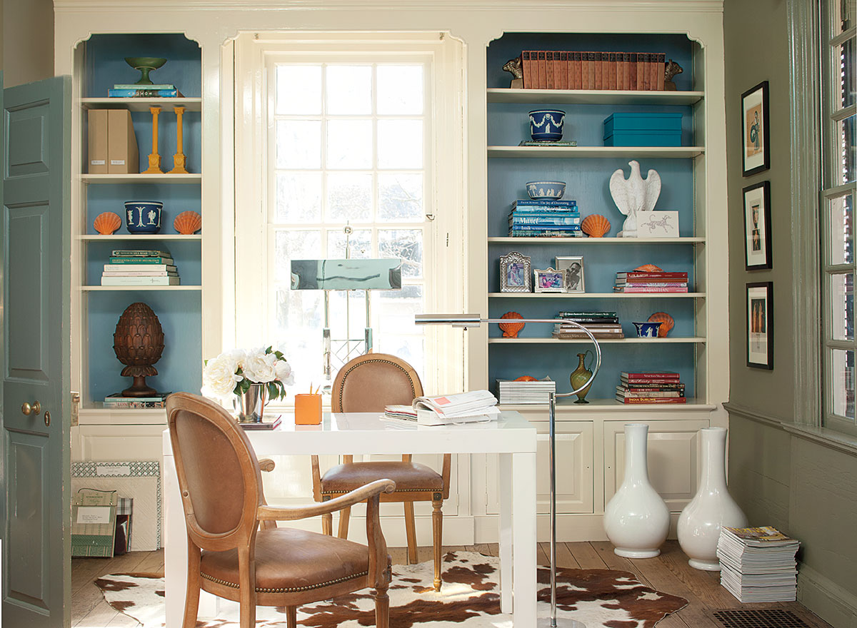
Shelves: Bracken Cream CW-105, Back of shelves: Williamsburg Wythe Blue CW-590
Cornwallis Red Williamsburg Paint Color
Talk about a color that says “Wow”! That Cornwallis Red is a showstopper! I love the way it pops against the Washington Blue.
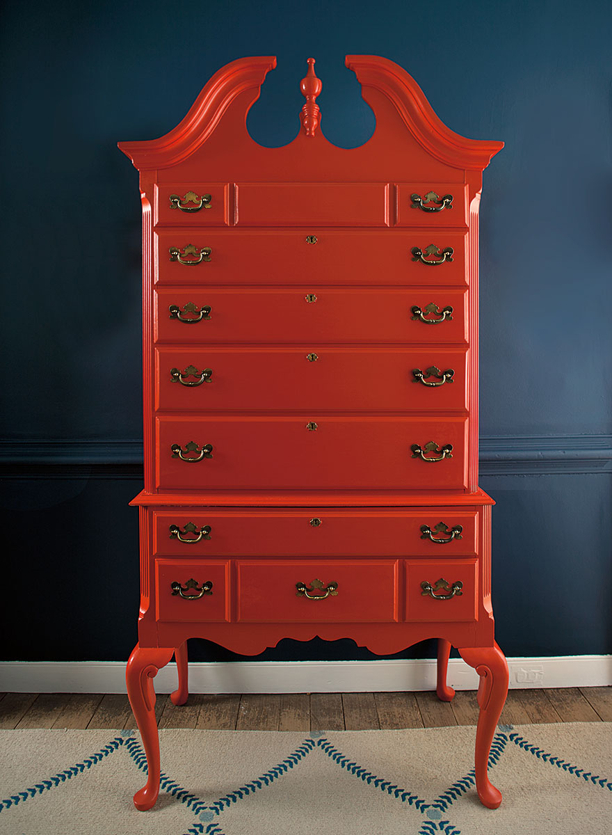
Walls: Washington Blue CW-630, Highboy: Cornwallis Red CW-315
Benjamin Moore Carter Gray
Carter Gray is such a striking, bold color and looks great with the blue and green bottles and the orange accents in this room.
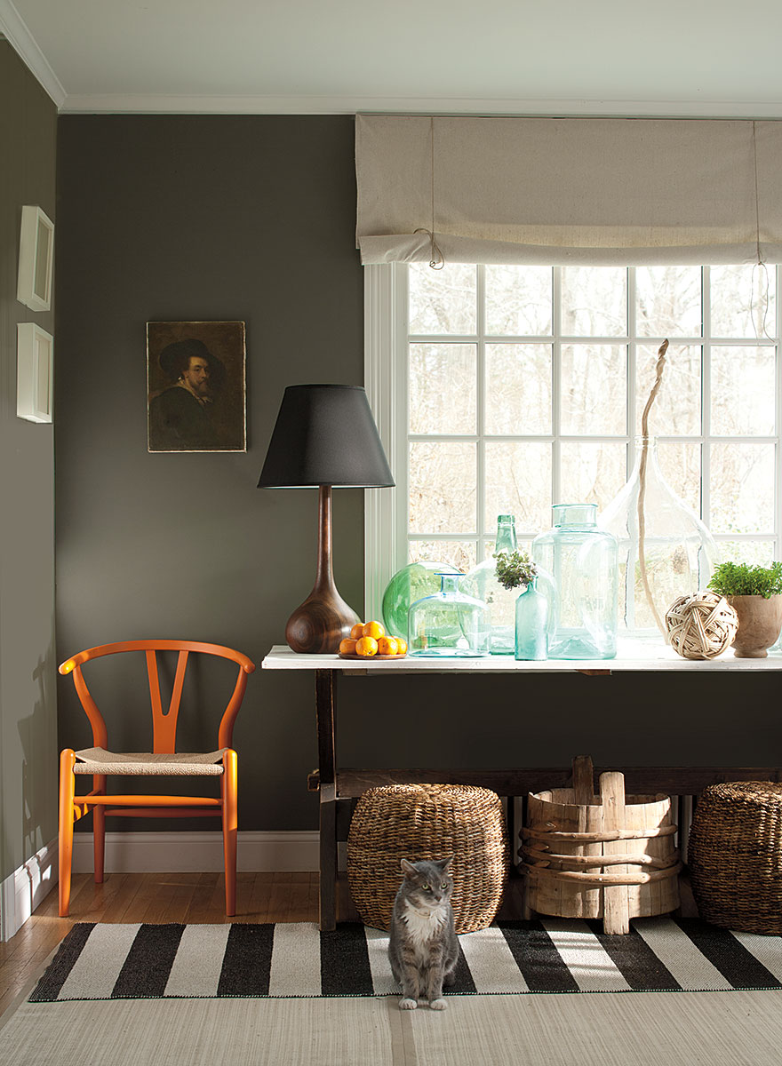
Walls: Carter Gray CW-80, Trim: Capitol White CW-10
Spotwood Teal and Everard Blue
This wall color is wonderful! If you’ve visited Williamsburg or any other similar historical sites, you know that the paint colors used back then were very different from what we use today. The colors then were vibrant and clear. Think bright greens, blues, reds, etc.
Walls: Spotswood Teal CW-545. Trim: Everard Blue CW-575
Benjamin Moore Harwood Putty
You just can’t go wrong with Harwood Putty. It’s a fabulous white with the slightest touch of cream.
Walls: Harwood Putty CW-5
Williamsburg Stone Paint Color
The Williamsburg Stone color is another great neutral that would go with most any other color.
Walls: Williamsburg Stone CW-25, Doors: Mopboard Black CW-680, Trim: Harwood Putty CW-5
Williamsburg Palace Pearl Paint
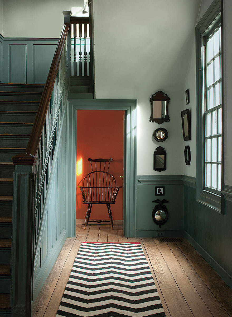
Stairs and Wainscotting: Williamsburg Wythe Blue CW-590, Walls: Palace Pearl CW-650, Back Hall: Claret CW-305
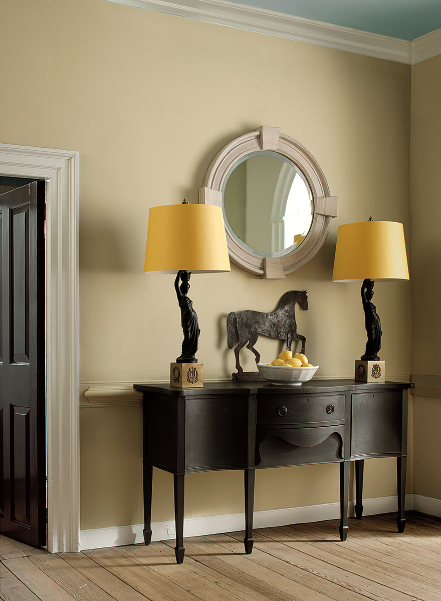
Williamsburg Damask Yellow Paint Color
Walls and trim: Damask Yellow CW-400
Williamsburg Mopboard Black
Door: Mopboard Black CW-680, Trim: Gunsmith Gray CW-65
Try a sample
Are you ready to try one of these beautiful colors in your home? Brush on samples are available from Benjamin Moore here: Color Samples.
And you can save $5 on your first order of peel and stick samples here: Peel and Stick Paint Samples.
Thanks so much for dropping by!


Those colours are phenomenal! I can't wait to order my deck! Thanks for sharing!
Aren't they gorgeous? I'm sure I'll be finding something soon that "needs" to be repainted, just so I can use one of these colors!
I see some colors I like in there! I'm a huge fan of yellow and teals and blues right now.
can I just say how much I love that medium minty green in the bottom row!!
I love that Carter Gray too! It goes against everything I'm trying to do in my house right now (lighten things up) but it's gorgeous. Thanks for all the inspiration… I have several rooms on the "to-paint" list.
I love this color palette! And this series